Top 5 Free Academic Poster Templates (PowerPoint & Illustrator) | Download & Design Guide
You have spent months collecting data, running simulations, and writing your paper. Now, you have 48 hours before the conference, and you are staring at a blank white slide in PowerPoint.
Designing an academic poster from scratch is a massive time sink. It requires knowledge of grid systems, typography, and print bleed margins that most researchers simply don't have time to master.
The solution? Start with a professional template.
Below, we have curated the top 5 free academic poster template styles available today. Whether you want the ease of PowerPoint or the precision of Adobe Illustrator, these layouts will ensure your research looks polished and professional.
1. The "Better Poster" (Generation 2)
Format: PowerPoint (.pptx) Best For: Maximizing engagement and readability.If you only download one template, make it this one. Created by Mike Morrison, the "Better Poster" movement revolutionized academic conferences. It moves away from the "wall of text" and focuses on a massive central insight ("The Main Finding") that can be read from 20 feet away, surrounded by a "Silent Bar" for detailed reading.
-
Why it wins: It respects the viewer's time and drastically increases the number of people who stop at your booth.
-
Where to find it: Search "OSF Better Poster" or visit the Open Science Framework.
2. The "Classic Scientific" (Tri-Fold Layout)
Format: PowerPoint (.pptx) Best For: Conservative fields and traditional conferences.Sometimes, you need to stick to tradition. The classic layout features a clear header, 3 or 4 vertical columns, and a logical flow from Introduction (top left) to Conclusion (bottom right). It is dense but familiar.
-
Why it wins: It is safe, universally accepted, and easy to organize if you are copy-pasting directly from your paper's IMRaD structure.
-
Where to find it: Sites like PosterPresentations.com offer dozens of these free standard grids in various sizes (36x48, A0, etc.).
3. The "Vector Pro" Minimalist
Format: Adobe Illustrator (.ai / .eps) Best For: Designers, Architects, and perfectionists.
For those who know their way around the Adobe Creative Suite, PowerPoint simply doesn't cut it. Illustrator templates allow for perfect kerning, vector icons, and infinite scaling without pixelation.
-
Why it wins: Crisp typography and the ability to handle complex vector diagrams that would break in PowerPoint. It signals a high level of professionalism.
-
Where to find it: Freepik and Vecteezy have excellent "Scientific Poster" categories with free attribution licenses.
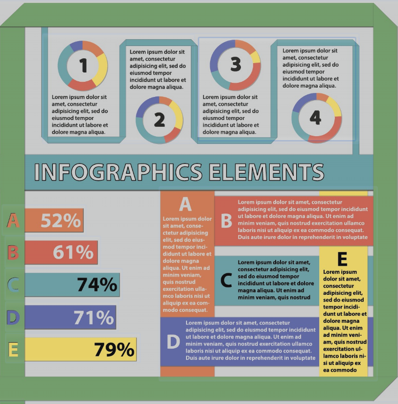
4. The "Visual Storyteller" (Infographic Style)
Format: PowerPoint or Canva (Export to PDF) Best For: Social Sciences, Public Health, and Humanities.
This style breaks the grid. Instead of rigid columns, it uses a central visual anchor (like a large map, a human body diagram, or a flowchart) with data points radiating outward.
-
Why it wins: It treats the poster as a piece of visual journalism rather than a manuscript on a wall. It is highly effective for qualitative research.
-
Where to find it: Look for "Infographic Research Poster" templates on Canva (Education accounts are free) or download infographic kits for PowerPoint.
5. The "University Brand" Standard
Format: PowerPoint (.pptx) Best For: Showing institutional affiliation.Before you go third-party, check your own institution. Most top-tier universities (Harvard, Stanford, MIT, Oxford) have dedicated branding sites where you can download pre-made templates with the correct school colors, official high-res logos, and approved fonts.
-
Why it wins: It builds immediate authority by visually linking your work to a prestigious institution.
-
Where to find it: Search "[Your University Name] brand identity poster template."
Quick Design Checklist Before You Print
Regardless of which template you choose, perform this 3-point check:
-
Check the DPI: If you imported images, zoom in to 100%. If they are blurry on screen, they will be blurry in print. Aim for 300 DPI.
-
Check the Bleed: If you have color going to the edge of the paper, ensure your template has a "bleed" margin (extra color extending beyond the cut line).
-
The "Arm's Length" Test: Print a text-heavy section on a regular A4 sheet of paper. Place it on the floor and stand up. Can you read the body text? If not, bump the font size up (Body text should be at least 24pt).